Oxblood & Plum: The Fall 2026 Color Palette Everyone’s Decorating With
Affiliate Disclosure: As an Amazon Associate, I earn from qualifying purchases. This post contains affiliate links at no extra cost to you—thanks for supporting Hello, It’s Heather!
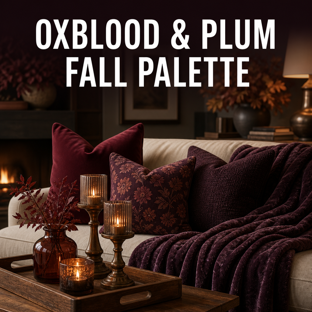
Every fall I get pulled toward the same deep, rich tones, and this year designers and Pinterest alike have put a name to it: oxblood and plum are the color palette of the season. I’ve started swapping a few pieces into my own living room, and it’s such an easy way to make a space feel instantly warmer without repainting anything. Here’s how to bring it in. 🍷
1. Oxblood Accents
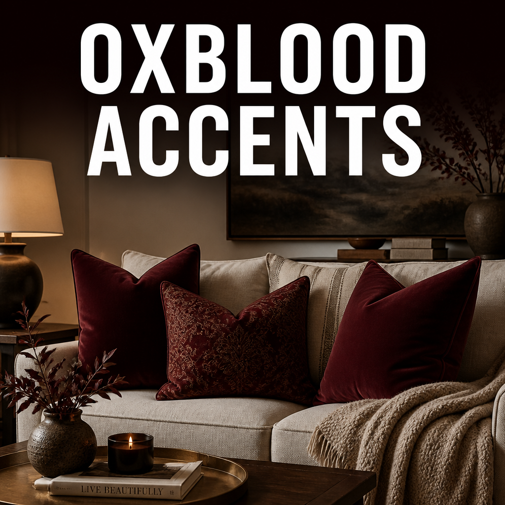
A deep, brownish-red that’s richer than a typical red and moodier than rust, oxblood is the anchor tone of this whole palette.
Why it works: It reads sophisticated rather than seasonal-cute, which means it works well past the actual fall months.
What to look for: An oxblood throw pillow or vase — it’s the easiest single piece to test the color before committing further.
Shop: Oxblood Throw Pillow Covers
2. Plum & Aubergine Textiles
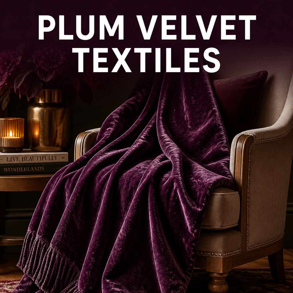
Plum brings a cooler, more purple-leaning counterpart to oxblood’s warmth, and the two look beautiful layered together in the same space.
Why it works: Plum adds depth and a slightly unexpected twist to a fall palette that could otherwise feel predictable.
What to look for: A velvet plum throw blanket — the fabric’s sheen makes the color feel rich rather than flat.
Shop: Plum Velvet Throw Blanket
3. Pairing with Warm Wood Tones
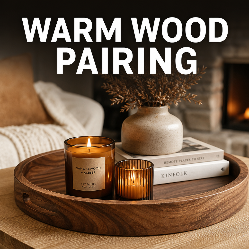
Both oxblood and plum need a warm, natural counterbalance so the room doesn’t feel too heavy or dark.
Why it works: Warm wood tones (walnut, oak) ground the richness of the color palette and keep the space feeling livable, not like a Victorian parlor.
What to look for: A wood tray or bowl in a warm walnut finish to sit alongside your new accent pieces.
Shop: Walnut Wood Tray
4. Metallic Accents That Complement
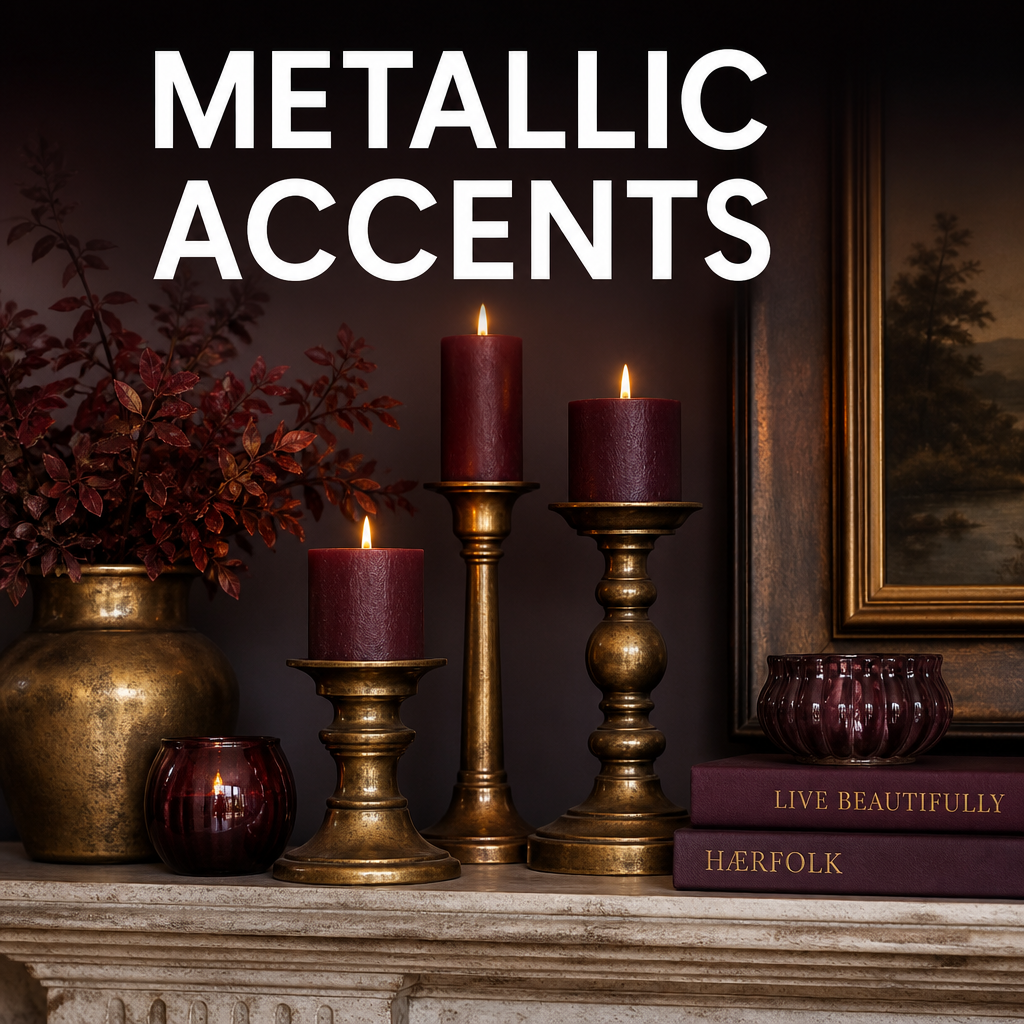
The right metal makes this whole palette sing — and it’s not the gold you might automatically reach for.
Why it works: Aged brass and bronze tones pull warmth from the oxblood without competing with the plum the way silver or chrome would.
What to look for: A bronze or aged brass candle holder — small metallic accents go further than large statement pieces here.
Shop: Bronze Candle Holder
5. Where to Start (Small Pieces First)
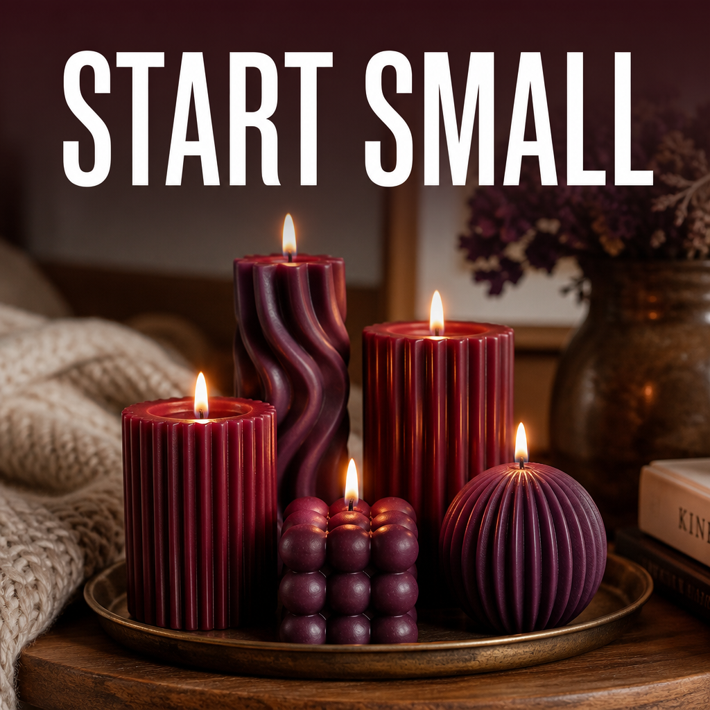
You don’t need to repaint a room to try this palette — a few textiles and accents are enough to completely shift the feeling of a space.
Why it works: Starting small lets you live with the palette before committing to anything larger like furniture or paint.
What to look for: A set of oxblood and plum candles together — an easy, affordable way to test both tones side by side.
Shop: Oxblood & Plum Candle Set
The Cheat Sheet
- Oxblood is the anchor, plum is the accent — use more of one and less of the other rather than splitting evenly.
- Warm wood keeps it livable — walnut and oak balance the richness of the color palette.
- Choose aged metals over polished ones — brass and bronze over silver or chrome.
- Textiles are the easiest entry point — pillows, throws, and candles before paint or furniture.
Oxblood & Plum Palette at a Glance
| Item | Why It Works | Shop Link |
|---|---|---|
| Oxblood Throw Pillow Covers | Anchors the palette affordably | Shop |
| Plum Velvet Throw | Adds depth and richness | Shop |
| Walnut Wood Tray | Balances the palette with warmth | Shop |
| Bronze Candle Holder | Complements without competing | Shop |
| Oxblood & Plum Candle Set | Easy way to test both tones together | Shop |
This palette is proof that fall decor doesn’t have to mean pumpkins and plaid — sometimes it’s just a deeper, richer version of the colors you already love. Save this one for your next decor refresh.
XO, Heather
📌 Save This to Pinterest!